Showing posts with label selen aslan. Show all posts
Showing posts with label selen aslan. Show all posts
Tuesday, 14 April 2015


Saturday, 11 April 2015
Friday, 13 March 2015

Final Film Questionnaire analysis

75% of the responses we got for the first question all rated our film 5 out of 5, this is great for us as a group knowing that our audience has enjoyed watching our film and they think its great quality. And for us it means we have done what we have been aiming to do, which is to please our target audience. 6.3% of the responses gave it a 4 out of 5 which is still really good, because it gives us a small negative that we will try and work on for our next project.
For the second question again we got a similar response, 12 people gave 5 for the question 'how would you rate the lighting in the film?' and the rest gave it a 4. We struggled with the lightening during the filming because of the time we would do filming during the day so the light would change constantly and that worried us, but now looking at the responses and seeing that the audience didn't acknowledge is great.
Question three which asked 'did you understand the storyline?' was a very big question as our storyline was abit complicated with a big twist at the end, and the responses we got for this question was superb, every individual that participated in this questionnaire said yes, this means that we have portrayed our film in the right manner for our audience to understand the plot and not get confused by it.
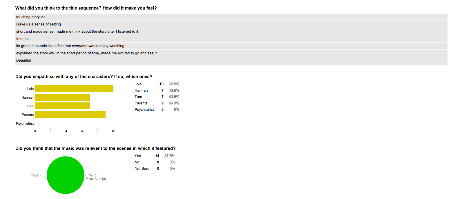
For question four we got a variety of different answers, but all the answers are very generous. This question asked the audience to give their opinion on how the title sequence made them feel, and all the answers were positive which is great because it means they have enjoyed watching it and not boring.
The fifth question got alot of mix opinions of who the audience sympathised with, most people chose Lola and the parents, which makes sense because we tried to make the audience have a connection with Lola from making the story from her point of view and giving her a likeable character.
Everyone said yes for the sixth question which was if the music matched the scenes, it took us a while to find suitable songs that would reflect the right emotion on the scenes and again its made us really happy looking a these responses and seeing that the audience agreed with our choices.

For the eighth question most people understood hannah's role in the film and a small percentage mostly understood which is great, because we were unsure on wether or not we portrayed her well, and the flashbacks at the end were abit confusing, so the responses were relieving knowing that the audience understood her.
Everyone say yes for the question 9, which was if they liked the cliffhanger at the end, we really struggled to portray the cliffhanger but the fact that the audience liked it and got it made us really happy knowing it was worth the struggle.

Thursday, 5 March 2015


Friday, 30 January 2015
Research into Viral ads
Research into Viral Ads
Cross media marketing is a form of cross-promotion in which promotional companies commit to surpassing the traditional advertisements and decide to include extra appeals to their offered products. The material can be communicated by any mass media such as e-mails, letters, web pages, or other recruiting sources. This method can be extremely successful for publishers because the marketing increases the ad’s profit from a single advertiser. Furthermore, this tactic generates a good liaison between the advertiser and the publisher, which also boosts the profits.
Viral marketing, viral advertising, or marketing buzz are buzzwords referring to marketing techniques that use pre-existing social networking services and other technologies to try to produce increases in brand awareness or to achieve other marketing objectives (such as product sales) through self-replicating viral processes, analogous to the spread of viruses or computer viruses ( Internet memes and memetics). It can be delivered by word of mouth or enhanced by the network effects of the Internet and mobile networks. Viral advertising is personal and, while coming from an identified sponsor, it does not mean businesses pay for its distribution. Most of the well-known viral ads circulating online are ads paid by a sponsor company, launched either on their own platform (company webpage or social media profile) or on social media websites such as YouTube. Consumers receive the page link from a social media network or copy the entire ad from a website and pass it along through e-mail or posting it on a blog, webpage or social media profile. Viral marketing may take the form of video clips, interactive Flash games, advergames, ebooks, brandable software, images, text messages, email messages, or web pages. The most commonly utilized transmission vehicles for viral messages include: pass-along based, incentive based, trendy based, and undercover based. However, the creative nature of viral marketing enables an "endless amount of potential forms and vehicles the messages can utilize for transmission", including mobile devices.
According to marketing professors Andreas Kaplan and Michael Haenlein, to make viral marketing work, three basic criteria must be met, i.e., giving the right message to the right messengers in the right environment:
- Messenger: Three specific types of messengers are required to ensure the transformation of an ordinary message into a viral one: market mavens, social hubs, and salespeople. Market mavens are individuals who are continuously ‘on the pulse’ of things (information specialists); they are usually among the first to get exposed to the message and who transmit it to their immediate social network. Social hubs are people with an exceptionally large number of social connections; they often know hundreds of different people and have the ability to serve as connectors or bridges between different subcultures. Salespeople might be needed who receive the message from the market maven, amplify it by making it more relevant and persuasive, and then transmit it to the social hub for further distribution. Market mavens may not be particularly convincing in transmitting the information.
- Message: Only messages that are both memorable and sufficiently interesting to be passed on to others have the potential to spur a viral marketing phenomenon. Making a message more memorable and interesting or simply more infectious, is often not a matter of major changes but minor adjustments.
- Environment: The environment is crucial in the rise of successful viral marketing – small changes in the environment lead to huge results, and people are much more sensitive to environment. The timing and context of the campaign launch must be right.


Examples of viral ads
Issues encountered during editing
Issues Encountered During Editing
We all came across issues such as realising that there were some shots missing or that needed to be added on so that there would be continuity in our film, we realised there were shots missing once we had put all the shots together so therefore we had to go out and do those shots. Also when editing we would realise that some props places had changed in some shots or the characters costume would look different so we had to redo those shots again,
Durig the filming procedure we filmed our shots in random order depending on which location we were filming in first and because of that while editing we came across problems such as the time of day, as one shot would be dark because it was shot in the winter afternoon and another shot would be sunny and because of this we had to edit those shots and change the colour format to not make it seem that obvious.
One big issue that we came across once our rough copy was done and posted on youtube, was that we realised 2 shots were not in focus however it had looked focused on the software before we posted it out so now we're going to re shoot those two shots to create a successful film.
Monday, 26 January 2015
Research into editing techniques
Research into editing techniques
EDITING
Editing describes the relationship between shots and the process by which they are combined. It is essential to the creation of narrative space and to the establishment of narrative time. The relationship between shots may be graphic, rhythmic, spatial and/or temporal.
Filmmakers and editors may work with various goals in mind. Traditionally, commercial cinema prefers the continuity system, or the creation of a logical, continuous narrative which allows the viewer to suspend disbelief easily and comfortably. Alternatively, filmmakers may use editing to solicit our intellectual participation or to call attention to their work in a reflexive manner.
Filmmakers and editors may work with various goals in mind. Traditionally, commercial cinema prefers the continuity system, or the creation of a logical, continuous narrative which allows the viewer to suspend disbelief easily and comfortably. Alternatively, filmmakers may use editing to solicit our intellectual participation or to call attention to their work in a reflexive manner.
Graphic Match
Graphic matches, or match cuts, are useful in relating two otherwise disconnected scenes, or in helping to establish a relationship between two scenes. By ending one shot with a frame containing the same compositional elements (shape, color, size, etc.) as the beginning frame of the next shot, a connection is drawn between the two shots with a smooth transition.
The first clip below, from Hitchcock’s Psycho, takes place just after a woman is brutally stabbed to death while in the shower. As her blood washes away down the drain with the water, the camera slowly zooms in on just the drain itself. A graphic match cut is then utilized, as the center of the drain becomes the iris of the victim’s lifeless left eye.
Rhythm
Rhythm editing describes an assembling of shots and/or sequences according to a rhythmic pattern of some kind, usually dictated by music. It can be narrative, as in the clip from Woody Allen’s Bananas below, or, a music video type collage, as in the second clip from Sofia Coppola’s Marie Antoinette. In either case, dialogue is suppressed and the musical relationship between shots takes center stage.
In Allen’s Bananas, the use of a vaudeville-esque tune recalls Charlie Chaplin and early cinematic comedy. Like Chaplin’s characters, Fielding Melish’s actions and adventures continually result in humorous misadventure. In the sequence below, he heroically expels two thugs from a subway car. The length of the shots is determined by the quick tempo of the piano recording: as the villains’ abuse of innocent passengers reaches a climax, the shots become shorter and shorter. The quick editing builds suspense before the hero unpredictably rises and throws them off the train.
Establishing Shot
The Establishing Shot or sequence serves to situate the audience within a particular environment or setting and/ or to introduce an important character or characters. The establishing shot is usually the first or the first few shots in a sequence, and as such, it must be very efficient in portraying the context. Typically, establishing shots are Extreme Long Shots or Long Shots, followed by progressively closer framing.
Quentin Tarantino introduces his film Inglorious Basterds, with an extreme long shot of the countryside, suggestive of rural France. It is followed by a medium shot of the dairy farmer, who will dominate the first scene. One of the man’s daughters is also shown, first in a medium shot and then in medium close-up, hanging clothes. Moreover, the sequence establishes the central conflict, with the arrival of the German motor cars, shown in POV shots from the perspective of the farmer and his daughter.
Shot/ Reverse Shot
Shot/Reverse Shot is an editing technique that defined as multiple shots edited together in a way that alternates characters, typically to show both sides of a conversation situation. There are multiple ways this can be accomplished, with common examples being over the shoulder shots, angled shots, left/right alternating shots, and often a combination of the three.In the first clip below, from Terry Zwigoff’s Bad Santa, we see a standard over the shoulder SRS. This, combined with eye-line matches between the two main negotiators shows how focused each is on the other. The over the shoulder technique allows the viewer to see the facial expressions of each character while listening or speaking. More importantly, the over the shoulder technique creates a sense of space between the characters greater than the actual distance between them. This keeps the frame from being uncomfortably cramped, and also shows the distance between the characters’ different standpoints.
Eye-line Match
In an eye-line match, a shot of a character looking at something cuts to another shot showing exactly what the character sees. Essentially, the camera temporarily becomes the character’s eyes with this editing technique. In many cases, when the sequence cuts to the eye-line, camera movement is used to imply movement of the character’s eyes. For example, a pan from left to right would imply that the character is moving his/her eyes or head from left to right. Because the audience sees exactly what the character sees in an eye-line match, this technique is used to connect the audience with that character, seeing as we practically become that character for a moment. Each of the following sequences is from No Country For Old Men, directed by the Coen Brothers.In the first clip, five eye-line matches are shown in a sequence that’s only a minute long. The first of these contains movement from left to right, mocking Llewelyn’s motion as he walks up to the dead body. We then see relatively still eye-line matches as Llewelyn looks at man’s face, and then at the gun as he picks it up. The next eye-line match is shown as Llewelyn opens the briefcase of money, which contains a slight zoom. This zoom is not necessarily used to mimic Llewelyn’s eye movement, but rather his thought and emotion, as the sight of all the money understandably “brings him in.” The Coen brothers decided to use so many eye-line matches in this sequence and in the rest of Llewelyn’s journey so that the audience would come closer to experiencing what he was experiencing.
Cut-in and Cut-away
This sequence, taken from Tarantino’s Sukiyaki Western Django (2007) provide an examples of the cut-in. Cut-out or away is the reverse, bringing the viewer from a close view to a more distant one. The sequence opens with an extreme long shot of the area’s landscape, a high-angled tracking shot (probably via helicopter) –giving us a wide panoramic view of the area. A cut suddenly transports the viewer somewhere within the landscape to a medium shot of character lying on the floor in his room.Continuity editing: The Match on Action
Match on Action is an editing technique used in continuity editing that cuts two alternate views of the same action together at the same moment in the move in order to make it seem uninterrupted. This allows the same action to be seen from multiple angles without breaking its continuous nature. It fills out a scene without jeopardizing the reality of the time frame of the action.In the first scene above, Peter Jackson uses matches on action to give the chase a sense of dynamism. The viewer can never assume what is going to happen next, as the scene is constantly shifting. He uses a very complex version of match on action, jumping from close ups to far away helicopter shots and back without a pause. It is almost dizzying, yet thrilling at the same time. Be sure to keep your eye on the white horse; this is the character we are following and although hard to see at times it is present in every part of the clip.
Parallel Editing
Parallel editing is a technique used to portray multiple lines of action, occurring in different places, simultaneously. In most but not all cases of this technique, these lines of action are occurring at the same time. These different sequences of events are shown simultaneously because there is usually some type of connection between them. This connection is either understood by the audience throughout the sequence, or will be revealed later on in the movie. The first clip is from No Country For Old Men directed by the Coen Brothers, and the second is from Batman: The Dark Knight directed by Christopher Nolan.In this first clip, we see parallel editing used primarily to add suspense to the situation. At first, the intervals between showing Lewelyn and Anton are relatively long, but as they shorten later on in the sequence, additional suspense is added. Just as we see in the previous clips from the film, there are many eye-line matches shown for both of the characters. This combination of parallel editing and eye-line matches for each line of action allows the viewer to practically experience both sides of the event first-hand.
Alternative transitions
Superimposition
Th following sequence is an example of superimposition. Superimposition refers to the process by which frames are overlapped, either mechanically or digitally, in order to achieve a layered transition. Japanese cinema sometimes uses traditional “kanji” calligraphy superimposed over standard film in several ways; the first of these being to illustrate a famous quotation or religious koan (a phrase chanted to bring about enlightenment), such as this example in which Tarantino says the Japanese proverb, “life is all about goodbyes” (サヨナラだけが人生だ) with the same words superimposed over the screen.Fade -in
In this sequence from Sukiyaki Western Django, the calligraphic message provides an example of the fade-in. The style used in “Sukiyaki Western Django” is reminiscent of filmmakers such as Kurosawa, who used this archaic writing technique to embed a sort of traditionalism into his media. All in all, this effect has the added value of reminding us that though we are watching a Western, there is a Japanese component that underlies all the events of the film, and we cannot forget this in sight of the lush mise en scène that encompasses the entirety of the piece.ALTERNATIVES TO THE CONTINUITY SYSTEM
In-Camera Editing
Long Take
Long takes are simply shots that extend for a long period of time before cutting to the next shot. Generally, any take greater than a minute in length is considered a long take. Usually done with a moving camera, long takes are often used to build suspense or capture the attention of audience of without breaking their concentration by cutting the film.The opening scene from Robert Zemeckis’ Forrest Gump follows a feather blowing carefree in the wind, eventually landing on the foot of the protagonist who proceeds to pick it up and place it in his suitcase. This scene acts as a metaphor for the whole movie, as the feather represents Forrest. Just as the feather blows around for what seems like forever, just going where the wind takes it until it eventually lands in a safe place, Forrest seems to just blow aimlessly through life, going wherever life and fate may take him with out too much consideration of his own, until he eventually lands in a happy place.
Jump-Cut
A Jump-Cut is an example of the elliptical style of editing where one shot seems to be abruptly interrupted. Typically the background will change while the individuals stay the same, or vice versa. Jump-cuts stray from the more contemporary style of continuity editing where the plot flows seamlessly to a more ambiguous story line. An example of this editing style can be found in the following clips from Capote (2005).
Associative Editing or “Montage”
The following clip is taken from Sergei Eisenstein’s Battleship Potemkin. This unique combination of shots shows a marble lion reacting to the sailors’ rebellion in the harbor. In the context of the story, the ship opens fire on Cossack reinforcements sent to quell its revolt. Eisenstein integrates lions sculpted in various postures to suggest that all of Moscow is awakening to the people’s cause. The sequence requires the viewer to interpret, to “read” the metaphor inherent in the statues and to derive a meaning from their presence in the diegesis.Hollywood-style Montage
Montage also describes the approach used in commercial cinema to piece together fragments of different yet related images, sounds/music, often in the style of a music video. The following sequence, from Pretty Woman (1991), is an example of the hollywood style montage. The film, starring Richard Gere and Julia Roberts, shows the main character Vivienne as she transitions from a scantily-clad, unrefined hooker, into Edward’s elegant, poised and well-dressed companion. The soundtrack plays over the background as snippets of various clothing and body parts are shown. In the concluding frame of sequence, the final product, the “new Vivienne”, approaches the camera in a white, tailored outfit and a ladylike hat.
Sunday, 25 January 2015
Shooting schedule and resources
Shooting schedule
On Friday the 14th of November 2014 we began filming our title sequence. It took in total about 1 hour to produce all the shots. It wasn't necessary to re-film any of our title sequence because we were all very happy with the outcome and feel that it looked good. Below, I have attached a rough copy of our title sequence which we produced and edited by December 2nd 2014. The title sequence itself will be using in our film, however, the shots used in the opening scene will not be used as we have re-filmed the whole scene with better shots.
We first began shooting the film on the 21st of November 2014 in the Health and Social room on the 2nd floor in Barnsley college. This scene was used to film the 'hospital scene' in which Lola first wakes up and sneaks out with Hannah. The room is set out with two hospital beds and a bedside table, however, we brought our own props to make it look more like hospital to add a sense of realism to our film and ensure it looks quite professional. However, after we filmed this and watched the footage back when editing it on Final cut express, we all decided as a group that although some of the shots were really good, for example the extreme close up of the eyes, we felt that we needed to re-film the scene again to ensure that we were happy with it. We began to re-film the same scene on the 3rd of December 2014 however, we did not have enough time to complete the whole scene so we finished off the filming on Friday 12th of December 2014, we also managed to film the stairs scene on this day which took us approximately 30minutes to film. I then took the camera equipment back to my house so we could film of the home scenes over the Christmas period.

On the 2nd of January we began filming the home scenes. We planned of filming these earlier however we had some setbacks which made us unable to do so, e.g.; snow on the ground, some members of the group ill and some members of the group at work. On the 2nd we managed to film the scene at Lola's house, the scene outside Tom's house, the scene when Lola goes to Hannah's house and the flashback scenes. Due to all the unfortunate circumstances of not being able to film on any other day, we were put under pressure to get all the scenes filmed with Demi on that 1 day. This is because Demi was dying her hair from blonde to brown on the 3rd of January. Unfortunately, the wind was really bad therefore we were unable to film much outside, this is why we slightly changed the storyline so instead of Lola and Hannah arguing outside Toms, We changed it so Lola went to Toms alone and then went to Hannah's house so the confrontation between both girls could take place indoors where the sound was a lot clearer. Putting aside all the set-backs, we were able to successfully complete all the shots on that day and when watching them back, we were all very pleased.


On Friday the 14th of November 2014 we began filming our title sequence. It took in total about 1 hour to produce all the shots. It wasn't necessary to re-film any of our title sequence because we were all very happy with the outcome and feel that it looked good. Below, I have attached a rough copy of our title sequence which we produced and edited by December 2nd 2014. The title sequence itself will be using in our film, however, the shots used in the opening scene will not be used as we have re-filmed the whole scene with better shots.
We first began shooting the film on the 21st of November 2014 in the Health and Social room on the 2nd floor in Barnsley college. This scene was used to film the 'hospital scene' in which Lola first wakes up and sneaks out with Hannah. The room is set out with two hospital beds and a bedside table, however, we brought our own props to make it look more like hospital to add a sense of realism to our film and ensure it looks quite professional. However, after we filmed this and watched the footage back when editing it on Final cut express, we all decided as a group that although some of the shots were really good, for example the extreme close up of the eyes, we felt that we needed to re-film the scene again to ensure that we were happy with it. We began to re-film the same scene on the 3rd of December 2014 however, we did not have enough time to complete the whole scene so we finished off the filming on Friday 12th of December 2014, we also managed to film the stairs scene on this day which took us approximately 30minutes to film. I then took the camera equipment back to my house so we could film of the home scenes over the Christmas period.
On the 2nd of January we began filming the home scenes. We planned of filming these earlier however we had some setbacks which made us unable to do so, e.g.; snow on the ground, some members of the group ill and some members of the group at work. On the 2nd we managed to film the scene at Lola's house, the scene outside Tom's house, the scene when Lola goes to Hannah's house and the flashback scenes. Due to all the unfortunate circumstances of not being able to film on any other day, we were put under pressure to get all the scenes filmed with Demi on that 1 day. This is because Demi was dying her hair from blonde to brown on the 3rd of January. Unfortunately, the wind was really bad therefore we were unable to film much outside, this is why we slightly changed the storyline so instead of Lola and Hannah arguing outside Toms, We changed it so Lola went to Toms alone and then went to Hannah's house so the confrontation between both girls could take place indoors where the sound was a lot clearer. Putting aside all the set-backs, we were able to successfully complete all the shots on that day and when watching them back, we were all very pleased.
This picture was taken whilst filming the 'home scene' at Lola's.
On Wednesday 14th January 2015, we filmed the final scene with Tom and the psychiatrist and also we used a zoom recorder to record Tom's voice over and got all the scenes with Tom in done on that day. However, another setback occurred when filming. Demi's sister, Jade Cash who was supposed to be playing the psychiatrist was unable to participate in the film making so we was an actress short. However, at the last minute, my sister, Amy Shutt volunteered to play the psychiatrist and we managed to get it filmed that day.
On Friday 16th January 2015, we filmed the 'accident scene' where Lola walks past the accident scene on her way to Toms and also the scene where the accident took place when Hannah pushes Lola into the road and she gets hit by a car. It took us about 1 hour to film these two scenes as it began to rain so we had to take the camera somewhere sheltered until it stopped.
This a picture to show the resources we took out to film on that particular day. We have the camera and the tripod. I looked at the weather forecast and it was forecast to rain that day so we were aware therefore I brought a large golfing umbrella to protect the camera and also a UV torch to flash into Lola's face to make it look like a headlight was hitting it.
On Friday 23rd of January 2015 we completed our final bit of filming which was in the same hospital scene we filmed for the beginning of the film. We also did some extra shots in which Lola is stumbling down the corridor making her way to the hospital room, including some point of view shots. In total, it took us approximately 4 hours to complete this scene.
This week, we are focusing on editing all our shots and creating a 'rough copy' of the film by the latest Friday 30th of January 2015. Therefore, we can then share a copy of this to friends/family and ask them to suggest improvements in which we can add to our final draft.
Saturday, 24 January 2015
Behind the scenes- Filming of Lola
We have a deadline to complete a rough copy of our short film by Friday 30th January. We have filmed all the scenes we needed to so far and this week we will focus on editing it all. Throughout the filming, we have taken varies pictures/videos to show what it has been like making the film and how our teamwork has enabled us to work together and successfully complete all tasks at hand.
Makeup


Using the Camera
We have all helped to film, taking turns using the camera and consoling with each other after each shot in order to ensure we were all happy with what we had filmed. We felt confident enough to use the bigger A2 cameras last year when filing our AS video therefore we felt a lot more confident using them again this year allowing us to experiment more.


Rehearsing the shots
Due to me and Demi being in most of the shots, we didn't have to
opportunity to see how each shot would look when filming, therefore we took it in turns to act out in each frame so we all had an idea of how the shot would look when filming it for real.

Makeup
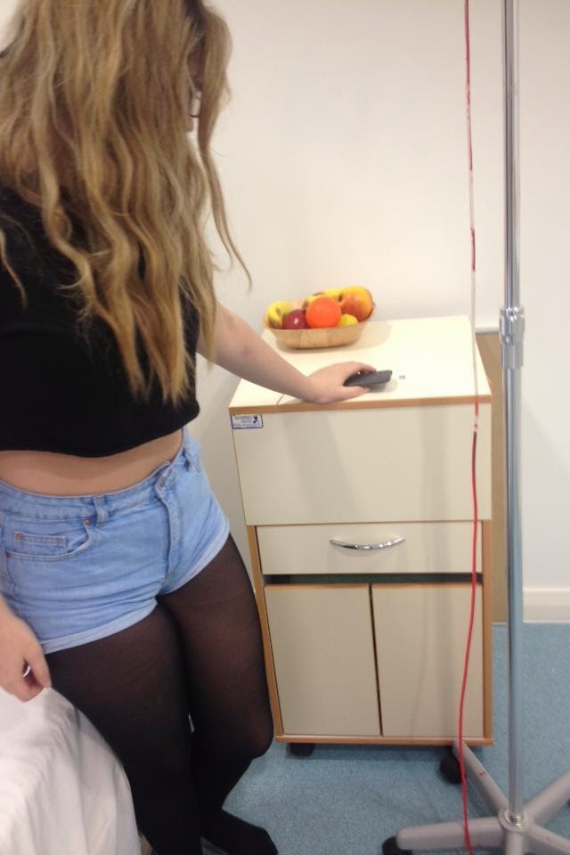
To achieve a 'unwell' look for the character Lola, Selen applied red, brown and grey eye shadow under my eyes to make them look drained and hollow. She also applied brown blusher to my cheekbones in order to exaggerate my facial shape and by enhancing the cheekbones it implied that Lola is fragile.
Using the Camera
We have all helped to film, taking turns using the camera and consoling with each other after each shot in order to ensure we were all happy with what we had filmed. We felt confident enough to use the bigger A2 cameras last year when filing our AS video therefore we felt a lot more confident using them again this year allowing us to experiment more.

Rehearsing the shots
Due to me and Demi being in most of the shots, we didn't have to
opportunity to see how each shot would look when filming, therefore we took it in turns to act out in each frame so we all had an idea of how the shot would look when filming it for real.

 |
Tuesday, 20 January 2015
How to make your film look professional
How to make your film look professional
1 – Depth Of Field
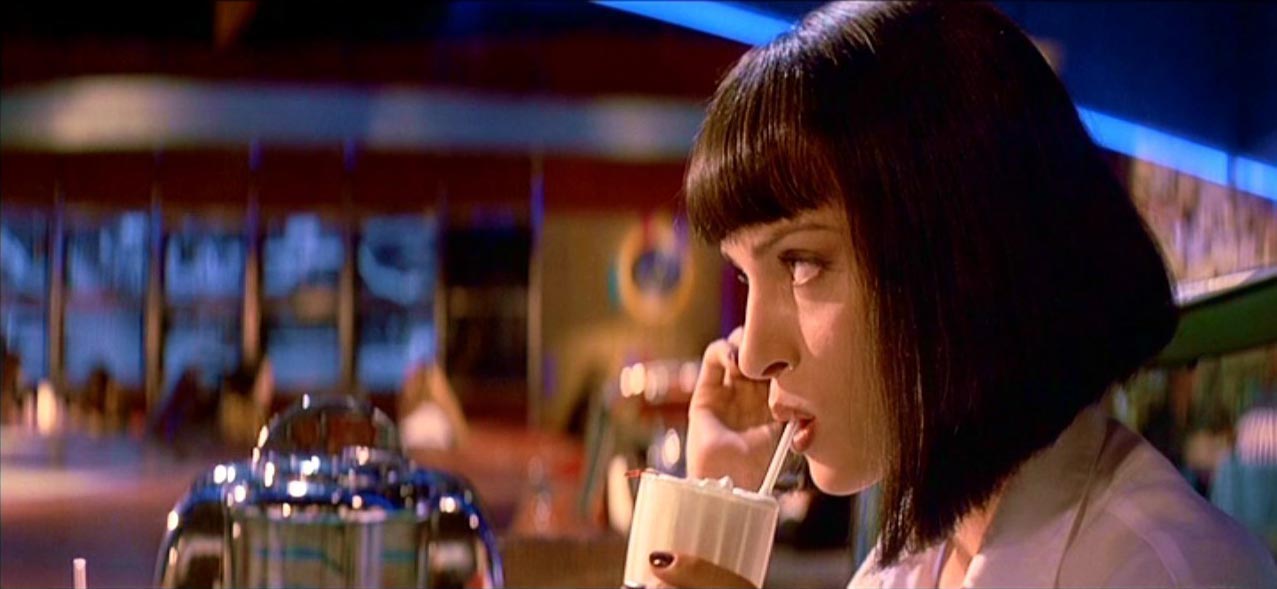
Many new filmmakers think that having a shallow Depth Of Field (DOF) is the single most important element in achieving a film look, hence the popularity of DSLR’s and other interchangeable lens cameras. For those of you that are new to this, DOF refers to the amount of the image that is in focus. Traditionally, feature films have made use of a shallow depth of field to selectively focus the attention on a person or object. Take a look at the photo below and note the areas in focus and those that are out of focus, drawing your eye in to the important part of the frame -
While I do agree that being able to achieve shallow DOF is necessary, it’s not by any means the most important variable on this list. In fact, since the early days of cinema there have been many films that used deep depth of field to their advantage as well. One of these films is arguably the best film of all time, Citizen Kane, which has some of the deepest DOF shots I have seen to date -

Ultimately DOF is a stylistic choice that you have to make based on the look you want to achieve with your film. With that said, the majority of feature films today utilize a shallow DOF on many shots, and if you want to get that look you’re going to need a camera and lens that can achieve it. For starters, DSLR’s or any other interchangeable lens cameras are typically quite good at achieving this look. The larger your sensor, the shallower your DOF will be, so a Canon 5D for instance would have a shallower DOF than a Lumix GH3 as the sensor on the 5D is larger. The other variable to consider is your lens choice. Longer lenses will always give you a shallower DOF than wider lenses. And fast lenses (for example lenses that are F2.8 or lower) will also help out with achieving this look. The more wide open you are on your lens, the shallower the DOF. So for instance if you are shooting on a 50mm lens at f1.4, your image will have a more selective focus than the same lens at f8. Be careful not to overdo this though, because one of the giveaways of DSLR footage today is footage that has too much of a shallow DOF. You want to find just the right balance.
2 – Frame Rate
This is an easy one – Shoot at 24 frames per second. Or at 24p on your camera. Since the earliest days of film, movies were shot and projected at 24 frames per second, and viewers have grown accustomed to this frame rate. Make sure that your camera is always set to this mode, unless you need to shoot at a higher frame rate to achieve slow motion. For example you may want to shoot at 60 frames a second so you could later slow it down to 24 frames a second while editing, and your footage will then play at 40% of the speed.
The main giveaway that your film was not shot at 24p is the lack of motion blur. Video footage is very clinical and sterile looking, and can be almost too perfect at times. Older video camcorders only shot at 59.94i (which is about 30 frames a second) and it created a look that was very realistic looking, but not cinematic. If someone were to walk through the frame for instance, every last frame of the footage would be perfectly clear. This sounds like it would be ideal, but it’s actually not. Real film exhibits motion blur when an object is moving through the screen, and in order to get that organic motion blur on your footage, be sure to shoot at the right frame rate. The film “The Hobbit” was shot at 48 frames per second and as a result many viewers did not enjoy watching the film. It looked too much like video and not enough like the surreal world of film. Here is a shot from “Pirates Of The Caribbean” exhibiting some normal motion blur:

3 – Shutter Speed
Make sure that you use the 180 degree rule when setting your shutter speed. This means when you set the shutter speed on your camera, set it to exactly double that of your frame rate. So if you are shooting 24p, make sure your frame rate is at 1/48 or as close as possible. Many DSLR’s only have a 1/40 or 1/50 setting, so experiment with those two options and see what looks best to you. Most cameras will work better with 1/50, but some (The Lumix GH3 for example) actually seem to work better at 1/40.
Having the wrong shutter speed can be pretty detrimental to your footage. If it’s too slow (1/20 for instance), your footage will look like it is strobing and ghosting as images trail off throughout the screen. And if your shutter is too high (1/100) your image will look like it’s been speed up, almost as if it’s in fast forward. It’s important to note that there are times that you do want to set the shutter speed at an unusually high or low setting, and even when shooting on film, this is a technique that is sometimes used to get a desired stylistic effect. But for 95% of what you shoot, the chances are you’ll want to stick with the 180 degree rule. This also means that if you shoot at a higher frame rate for slow motion (60p let’s say), than you will need to set your shutter accordingly. In that example it would be set at 1/120.
4 – Camera Movement
Not enough filmmakers seem to pay attention to this, but camera movement is definitely one of the most important aspects of getting a film look. Camera movement can include everything from sticking your camera on a tripod and deciding to have no movement at all, to going handheld, to putting your camera on a jib and getting a crane shot. There isn’t a specific movement that will make your film look more cinematic, but the more importance you place on camera movement, the more cinematic your film will feel. Some indie films suffer from very poor camera movement and may contain scenes that are partially shot handheld and partially on a tripod. This will make your film very difficult for your viewers to watch.
Also, make sure that you choose the right type of camera movement for each scene. If your scene doesn’t call for handheld work, than don’t shoot it that way. It will only cheapen the look of your final product and make the audience feel less connected to your piece as the visual elements are not properly tied together with the narrative storyline and flow.
5 – Don’t Blow Out The Highlights
A big giveaway of digital footage are blown out highlights. Since most digital cameras have much less dynamic range than film, the are prone to clipping or blowing out the bright areas of the frame. On film, when this happens, it’s actually fairly pleasant to look at, and many directors, like Stephen Spielberg for example, actually intentionally will blow out some shots to get a stylized effect -

Unfortunately on video, blown out highlights look really bad. The light doesn’t bloom or roll off the same way that it does on film, and your image starts to look very harsh and synthetic. To deal with this, just make sure that you aren’t overexposing anything in your frame – unless it is something so bright (like the sun or a lightbulb) that it has to be blown out. Bring your exposure down far enough that the bright areas of the frame still have detail in them, and that will already put you in a better place. What may happen then though, is your subject or foreground may be too dark in some areas. You then have the choice of either leaving it as is, and allowing your subject to be in silhouette, or alternatively you could bring in more light to fill out the scene and lift up the shadowy, darker areas.
6 – Framing
I can’t stress enough how important proper framing is to a cinematic image. So many of the things on this list (which are all equally important) get completely thrown out the window with bad framing. If you have a well lit shot with a nice shallow DOF, but the subject isn’t framed right, than everything else you’ve done gets diminished. Great framing not only will make your video feel more filmic, but it will make your film better as a whole. The framing of an image can tell a story in itself. Just take a look at this frame from The Kings Speech, where a very unusual framing was utilized to create a sense of emptiness in the characters life -

7 – Lighting
Great lighting can make or break your shot, no matter what medium you’re shooting on. That said, certain formats – especially film, are much more forgiving with poor lighting than digital. Some low budget filmmakers are tempted to just pick up a digital camera and start shooting without thinking enough about the lighting of their scenes. Doing this can be another huge giveaway of a very low budget and amateur production. You by no means need to spend a huge amount of your budget on lighting if you don’t have the money for it, but you need to pay as much attention to proper lighting as possible. Whether you’re shooting with a large lighting setup or just using bounce boards and practical lights, it’s the attention to detail that counts. No amount of color grading will ever be able to save a shot that is just poorly lit, so make sure that your shots are not only exposed properly, but also lit in a way that sets the mood and tone of your scene.
I’m not going to delve too deeply into specific lighting techniques as there are too many to address here, but check back soon as in the coming weeks I will be doing a lighting tutorial that will go into more detail on this.
8 – Color Correction
In post-production and specifically while color grading, you can do a lot to make your video look more filmic. Ideally you’ll want to decide on a look before hand and then bring your footage into some grading software (I recommend DaVinci Resolve, but anything will do really) and start to tweak your settings accordingly. A big mistake that I see often is amateur filmmakers will over-do the color on their film. They will go in and apply a heavily stylized look to every shot in the film, making it look more like a music video than a feature. A good starting point when coloring is to make your footage look as natural as possible. Once you’ve gotten your white balance and exposure to the right spot, you’re already most of the way there. Most films (action and horror genres aside) are actually not that stylized. They usually have very accurate colors and aren’t covered in a wash that makes them feel unnatural. With that said, feel free to add warmth or cool down your footage as needed to suit the mood of the film, just don’t go overboard.
You’ll also want to consider your black levels and contrast. Film can be noticeably lower contrast than video, and you can do a lot in post to achieve this look. First off you could try to simply reduce your contrast setting (but don’t go too far with it), and then lift your black levels just a touch. Make sure that your blacks aren’t too “crushed” (or dark) in the wrong areas, and you will be well on your way to finishing your film look. Take a look at this shot from Upstream Color which was graded quite well to look more filmic, and has some lighter black levels -

9 – Film Emulation
This is not a necessary step, but one that I feel can really put the icing on the cake after you’ve followed everything else on this list. Film emulation is a technique that literally allows you to apply the look of a specific film stock to your footage, adjusting the colors and grain to match that of your chosen film stock. Like color correction, you don’t want to go overboard with this technique, but when used tastefully it can make a world of difference. Right now the best software out there for emulating film stocks is FilmConvert. I’ve used it on many projects and it’s really quite good. It gives you full control over the film stock you would like to apply, as well as the amount of grain and even the film size (8mm, 16mm, 35mm, etc), amongst many other features.
Here is a quick before/after sample from a shot I ran through the software -
Before

After

Wednesday, 7 January 2015
Research into Radio Trailer
Radio Trailers
Radio Commercial Link
Example -
Radio Commercial Link
Whether you are preparing a presentation for a large corporate group to be viewed online or by big screen or you are trying to create a documentary, finding great voice overs can really make a difference in the reception of your production by others. Choosing the right voice for the project is essential to making a production that keeps the crowd interested and creating one that puts the group to sleep. Using a company to help you choose the right voice overs for your project can really reduce the amount of time spent reworking the production to get just the right success level.
Voice overs are used for productions of all types including the creation of animated features. The voice of the production can really change the tone of the work. With the right voice the story you are trying to tell can be relayed effectively. Individuals who are voice overs are voice actors that can put themselves into the character they have are portraying. They have to study the character just like any other actor to make sure they are using effective language and tone when creating the production, whether a movie or presentation.
When selecting a voice actor for your voice overs there are a great number of things to consider before setting on one option. The individual should have a good grasp of what the project is and the audience that will be receiving it. This is an important part of creating a voice character that will work as a vehicle to transport the ideas of the production to those it was intended for. The voice actor will need to be vested in the character and storyline that is put in front of them in order to convince the audience. With the proper ability to tell a story the audience will fully engrossed in the feature and the intended job of the production will be a success.
Some of the jobs of voice overs include such things as a movie trailer voice, someone to run radio station promotions and advertising, television commercials, narration of documentaries and movies on television, audio for website content, voices for telephone hold messages as well as voice mail messages, podcasting, educational videos, books on tape, audio books and corporate presentations that are conducted online or through big screen meeting videos. A voice over actor can also help with translation of foreign materials in video and sound.
Example -
Tuesday, 16 December 2014
Poster analysis

Purpose:
The poster for the film The lovely Bones straightaway shows who the main character is by putting her in the centre of the poster faded, and possibly on the bottom middle as well. Suggesting that the film is focused mainly on her.
Audience:
The audience for this film is PG/13. I believe the poster represents the age certificate by using a young character to focus on, and the colours and effects used, such as fade out and the smooth colours show an innocent non violent theme.
Colour:
The colours that stand out the most are blue and yellow, I think these colours link in with the storyline, yellow can be represented as the heaven and the blue can be inbetween where she currently is. The fact that she is inbetween both of these colours can again represent the concept of the story that she is stuck inbetween.
key image:
The key image that stands out on the poster is the main characters face in the centre of the poster. I believe the faded effect gives her a ghostly effect and this can link in with the storyline as in the film she is not alive but not dead, so the faded effect portrays this look. Her face expression shows that she is desperate, which can make the audience think why?
Realism:
The poster does look realistic in a strange way. The poster overall does look very ghostly which the theme isnt relaistic but the storyline can be and i think from the way this theme has been linked in with everything else on the poster it does give a realistic effect. Such as the main characters face, it looks like she is looking directly as you therefore makes you think why does she look so desperate and sad.
Text:
The text effects on the poster are very simplistic. The colours used are white and pastel yellow. I think these colours does make the text stand out from the dark black background on the lower section of the poster. The size of the texts aren't all proportionate, the title does stand out and thats the most important text anyway.
I really like this poster. There is a great comparison between both our storylines, however I would like to think ours is more realistic and less edited so therefore the layout would not be suitable for our film. I do like the blurred effect on the key image and I think it does look really impressive. I don't like that its giving too much away however, I think it would be a lot mysterious if it was abit more simplistic.

Purpose:
The purpose of this film poster is to make the audience feel sympathetic towards the young girl. It also introduces one of the main actors to the audience aswell.
The audience for the film Les Miserables is PG/13. There is no violence or blood portrayed on this poster so therefore portraying the age restriction.
Colour:
There are mainly dark colours used on this film poster, I think this reflects the time period of the film but also give abit of a hint of the storyline, as the young girl is being hidden from the darkness. The only brightness is portrayed through the young girl whose face is in the centre of the poster. This does give her an angelic, innocent look and i think the audience would sympathise with her as she does look scruffy and dirty. Her bright blue eyes again adds colour to the poster and does make the audience feel for her.
Key Image:
The key image on this poster is the young girls face in the centre of the poster, she stands out from the background. I think this key image is used to represent to reflect the plot of the film as the film revolves around this young girl.
Background:
The background is dark and doesn't add much to the poster, but it does help to make the key image stand out.
Realism:
The poster does have a realistic effect. Its very simply with a plain background and a single main image of one of the main characters in the center so therefore makes the poster seem realistic.
Text:
The colours used on the text are gold, which does give the poster a theatrical effect which it is. The size of the fonts aren't too big but the title is and its font is also different from the rest adding a bit of a theme to the poster.
Usability:

The purpose of this poster is to let the public know which director has made this film, but no other information is revealed.
Audience:
The age certificate for this film must be 15/18, as the colours and the blood shown suggests there may be abit of gruesome scenes or maybe violence.
The colours used are very simple, white, black and a bit of red. These colours does make the film seem sinister and odd. I think that is also another purpose of this film poster. The contrast between white and black can be the angel and the devil, as the images on each side of the poster also gives that idea away.
key image:
The key image in this poster are the hands that are in symmetrical to one another, one seems to be obeying while the other one seems to be controlling in the darkness. I like the simplicity of the key images as it makes the audience think the meanings behind it even more.
background:
Realism:
The poster does not look realistic as the images and the colours used makes it complicated for the audience to understand what the storyline for this film may be.
Text:
The text used is very simple with the rest of the other bits on the poster, I think this helps for everything to blend in. The colours used on the text are white and black, again blends in with the rest of the poster. The size of the title is really large and does stand out along with the key images, this does help the audience to remember the name of the film as it is very large.
layout:
The layout of the poster is very structured and simple, the two colours used cover half the page each and the symmetrical key images used of the hands again gives abit of a hint of the age certificate and the storyline. The text above the key images that publicated the film director does also stand out along with the films title below the key images. Everything overall does seem catchy as it is very simple.
Usability:
I really like this poster, I think its got its own twist with a mystery, and it makes you want to watch out for the trailer and do abit of research. I like how the title is really big and yet it evens out the poster, it makes the audience also remember the name of the film so therefore is doing its advertisement part successfully well.

Purpose:
The purpose of this film poster is to advertise the film but also to show who the main chacacter in the film will be.
Audience:
The audience for this film I probably a 15 as it seems like a psychological film with abit of violence. This is represented through the key image which is the main character who looks physically and mentally drained out. She does look like she's been abused as a bruise is visible on her cheekbone.
Colour:
The colours used are very simple in a natural way. The black background allows the key image to stand out which is the main character.
key image:
The key image is of a woman which is possible the main character in the film. She looks really tired and emotional, the title of the film does sound sinister and can give the audience abit of a hint as in to why the main character looks drained out and abused. The main character being a girl who looks damaged does portray the typical stereotype that women can be hysterical and weak when it comes to supernatural. The woman is not facing towards the audience suggesting that she is too afraid or distracted by whatever she is looking at, again making the audience think about the possibilities.
Background:
The background of the poster is black/black and blurs around the main image which allows it to stand out and be in focus. The background does look dirty with the misty blurry colours being blended in together.
Text:
The title and the rest of the text on the poster have a normal size and isn't too large. The colours of the text are gold/white with a blurred effect which has been used to drag the title name out so it looks more mysterious and ghostly effect, suiting its genre.
Usability:
I really like the sinister look of the key images position, I think by her facing a different direction it has created a more mysterious effect. What I think I would use on this poster on our poster is the same colour effect on our main character, I really think the dirty bruised looks really powerful and I think the fact that our main character has had a car crash so therefore she will also be bruised will look good on the poster.

Purpose:
The purpose of this film poster is to let the audience know its a PG/13 film. It portrays a family portrait of a mother and possibly her two daughters. I think that it is also trying to advertise the film actors aswell like Cameron Diaz who is on the Hollywood A list for her acting career, and so is Abigail Breslin who has just recently started building her portfolio up in the film industry. I think that by using the two main known actors in the center of the poster is trying to build up an audience.
Audience:
The audience for this film is PG/13, this is because there seems to be no violence on the poster, instead a family is being portrayed suggesting its an all aged film. The films name 'My Sisters Keeper' also suggests that it is a family based film.
Colour:
The colours used are very calm and heavenly in a way. The bubbles along with the greeny/blue background effect makes the poster look like a very beautiful peaceful art.
key image:
The key image on this poster is the main actors in the center of the poster, which is Cameron Diaz and Abigale. These two actors are really well known in the film industry so therefore the key image of these two acotrs sell the film to the actors fans and those who also who know about them.
Background:
The background is very calm and peaceful, the bubbles and the the blue background colour gives the poster a very heavenly look. Which may be linked in with the storyline.
Realism:
The poster does look realistic as the effects used suits the films age certificate. The colours are blended in and doesn't stand out. The key actors used in the centre of the page seem to look like they have a strong relationship, the young girl on the bottom seems to be very pale compared to the other two characters suggesting she may be sick again making the film sound realistic.
Text:
The texts used are very simple and the colour of it is also white which again makes the poster seem very casual and realistic. This effect does suit the age certificate as the title isn't over exaggerated.
Usability:
I really like the realism on this poster. The storyline is quite similar to ours however ours is a little bit more supernatural. I really like the warmth and the natural chemistry the characters portray on the poster. I think the relationship between Lola and Hannah can also be reflected in the similar way.

Purpose:
The purpose of this poster is to show who the main actor is and also the content of the time of the film.
Audience:
The audience for this film would be a 15. The violence and the gruesome scenes would make it difficult for anyone below that age to watch.
Colour:
The colours used are very natural which does make it realistic. The shirt that the man is wearing does look scruffy which suggests he may be the main character who was a slave for 12 years and therefore the film revolves around him.
key image:
The key image on this poster is the guy who seems to be running. This key image may represent him trying to run away from slavery.
Realism:
The poster does look realistic as there arent alot of images just one key image of a man running. The title and the history of the title is real so therefore makes the film sound interesting and does make the audience feel sympathy towards the key actor on the centre.
Text:
The text is also very simple with a touch of gold on the number 12 which does make it stand out from rest of the white text.But the text overall is simple making it balance with the layout of the poster as its not overpowering the key image used. But the underline on the title does make a point and makes the audience remember the name.
Usability:
I really like this poster. I think in a way the main character does have a connection with Lola. I think it would look great if Lola was also running but in her hospital gown with bruises on her. This effect would make the audience feel sympathy towards her but also it would make the audience think what is she running away from.
Subscribe to:
Posts (Atom)