Monday, 23 February 2015

Research into viral ads

Research into viral ads
 
 
Viral advertising spreads messages, ideas and associations about a brand quickly, commonly using digital technology – in many ways viral advertising relies on the consumer to pass on information with the producer either seeding videos via YouTube, Facebook, Twitter or on many other interactive digital platforms with the consumer at the point, knowingly or unknowingly spreading the communication – viral advertising spreads like a cold virus, often quickly and efficiently affecting a large number of people. With advertising, even a negative reaction to a brand communication is considered to be impacting on a potential consumer in as much they have remembered the brand. I can remember many awful adverts from years ago for brands whose name I can remember, the visual images of which I can still see in my minds eye I the same way I can remember many of the viral ‘mash-ups’ of the Cadbury’s Gorilla advert from 2007.
 
 
Viral marketing creates ‘excitement’ and anticipation using spontaneous peer-to-peer brand marketing and can also include SMS text messages, email as well as an integrated interactive online campaign. Typically viral advertising has lower production values than traditional, ‘above the line’ audio-visual and print advertising but must look credible enough to establish connotations of brand identity through house style e.g. use of characters, typography and font, diegetic and non diegetic sound, graphics etc. Viral advertising is seen as highly profitable because it has lower production values and can reach a wide audience in a very short space of time – it can also be focused and easily controllable in terms of platforms and timescales. Often viral advertising is also used to kick start a campaign with ideas about a brand spread, deliberately with the intention of creating narrative enigmas – consumers that do not understand what they see and question in terms of content are that little bit nearer to being consumers of the brand, as in the Compare the Market long running advertising campaign. This early content can be planted in blogs, articles or message board postings for example to generate ‘buzz’ and are rarely focused on the brand itself, more the ‘product image’.
 
Product image are the associations consumers (or potential consumers) make with a piece of creative advertising, however abstract e.g. using the examples above, what has a gorilla and a meerkat directly got to do with a chocolate bar or an insurance price comparison website? Creativity and simplicity is the key on behalf of the advertiser (producer) to obtaining success – get the message across swiftly. Famously in 2000 Hotmail went from next to nobody to 30 million users with the viral email advert: “Get your own free email at hotmail.com” in the early days of internet digital technology. Market research into viral advertising suggests that the top 5 reasons for passing a communication on is:
  1. To make people laugh
  2. To recommend something
  3. As part of a competition
  4. To earn you/save you money
  5. As part of as perceived ‘noble’ cause e.g. a charity.


Examples of viral ads

Devil Baby Attack - promoting the film Devils Due


Monty the Penguin  - John Lewis


Real Beauty Sketches - Dove


How it feels through Google glass - Google

Analysis of a film poster

Analysis of a film poster
 
The Eye:
 
 Although this film poster aims at a different audience with a different genre, our final poster is hoping to have a similar outcome to this one. The main focus of the poster is the eye, which suits well as it matches the film name. It takes up majority of the page and has been edited to give an eerie feel to it. The iris has been edited red in colour, to give connotations of blood due to it being a horror film. The rest of the eye/poster is also edited to give it shadows and a more dull sinister feel. To add to the horror, there are fingers crawling out of the eye to make the whole poster more creepy. This is something we similarly want to achieve with out poster, minus the horror.
In our film, we have an extreme close up shot of Lola's eyes which we were going to use in our poster. We will similarly edit it to give it shadows and make the character's eyes look more interesting and appealing. In this poster, the character eye has been edited red which is something we could also copy to make the character look more dead or eerie.

The text in the poster is very simple, sticking to the bottom of the page. This makes it so there is nothing around the eye distracting you from it, making it even more prominent on the page. The title and main actors name are quite clear from first glance as these are the main interest points that the audience looks for. The rest of the information is towards the bottom of the poster, not as noticeable as the rest of it. This is to not draw away the focus from the eye as posters are usually viewed as someone pass's by them. The word 'EYE' is written in bold and matches to the main image. It doesn't give much away about the film, which is something that the creators may have wanted to make the audience more ambiguous as to what happens within the film.
This is something we could take into consideration when making our poster. As we also want to focus it around Lola's eyes, we could also place text at a different point of the page, but make sure the title and main actors name is still in focus. This is to make the eye the main focus part of the page and to not give anything away of what happens in the film.

Overall, the poster gives off an eerie, sinister feel and captures the audience through the simple editing of the eye. This is something we will try to achieve when making our film poster so we will try to take inspiration from this one.

Friday, 13 February 2015

Film Reviews of Similar Films

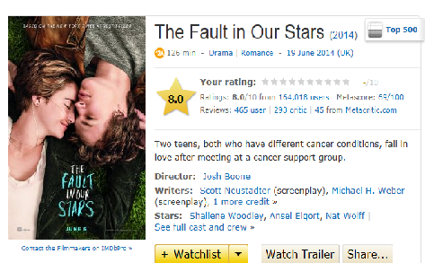
The Fault In Our Stars(2014)
This movie is similar to our film in that it has themes of death, love, coping and adolescent life. I wanted to see if it was popular to the shared target audience we have with this film, to ensure our film would be successful with our audience.


After looking on popular film review sites such as 'IMDB' and 'Rotten Tomatoes', I found that this film had a great reception from a wide audience. IMDB rated it 8/10 and it is in the top 500 movies that are listed on the website, alongside Rotten Tomatoes who rated it 81%. It grossed $124,868,837 at the box office in the USA alone, highlighting its popularity and success.


There were hundreds of positive reviews found online by well-known critics that were all captivated by the emotional rollercoaster that this film promises to deliver. In general, it was clear that many of the critics who reviewed the film in a good light commented on the empathy that the film encouraged them to feel and how relatable the characters were, specifically to a teenage audience.